That nagging feeling when you walk into a room that "something's just not right" usually isn't caused by picking the wrong colors—it's the imbalance in color proportions that's to blame. Even the most expensive furniture and carefully chosen curtains can end up looking chaotic if they aren't combined in the right ratios. In this guide, we break down the simple yet effective methods professional interior designers use to establish lasting color harmony in your home.
The 60-30-10 Rule: The Fundamental Formula for Color Palettes
The most widely used method in interior design is dividing the colors in a space into three main proportions:
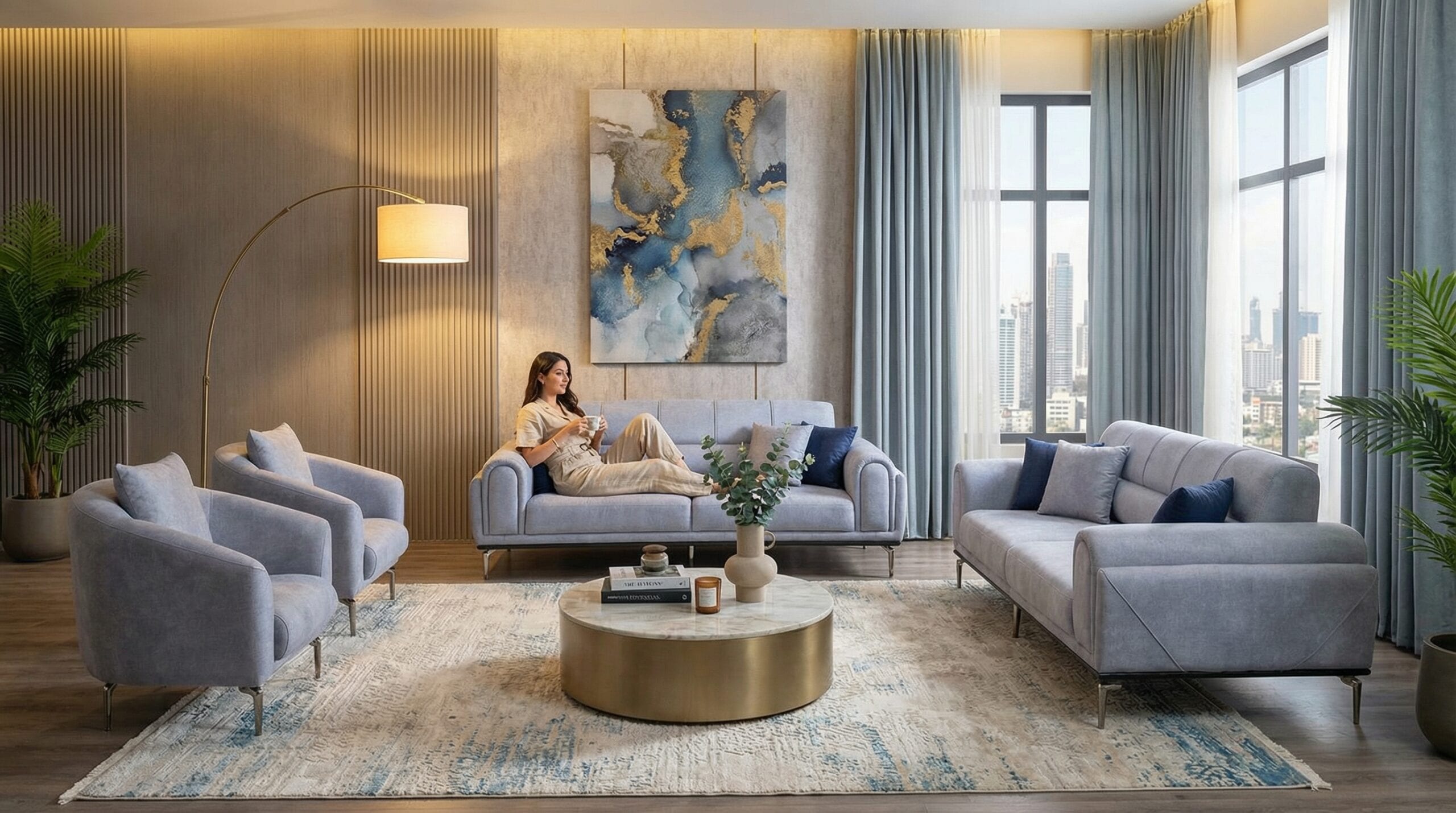
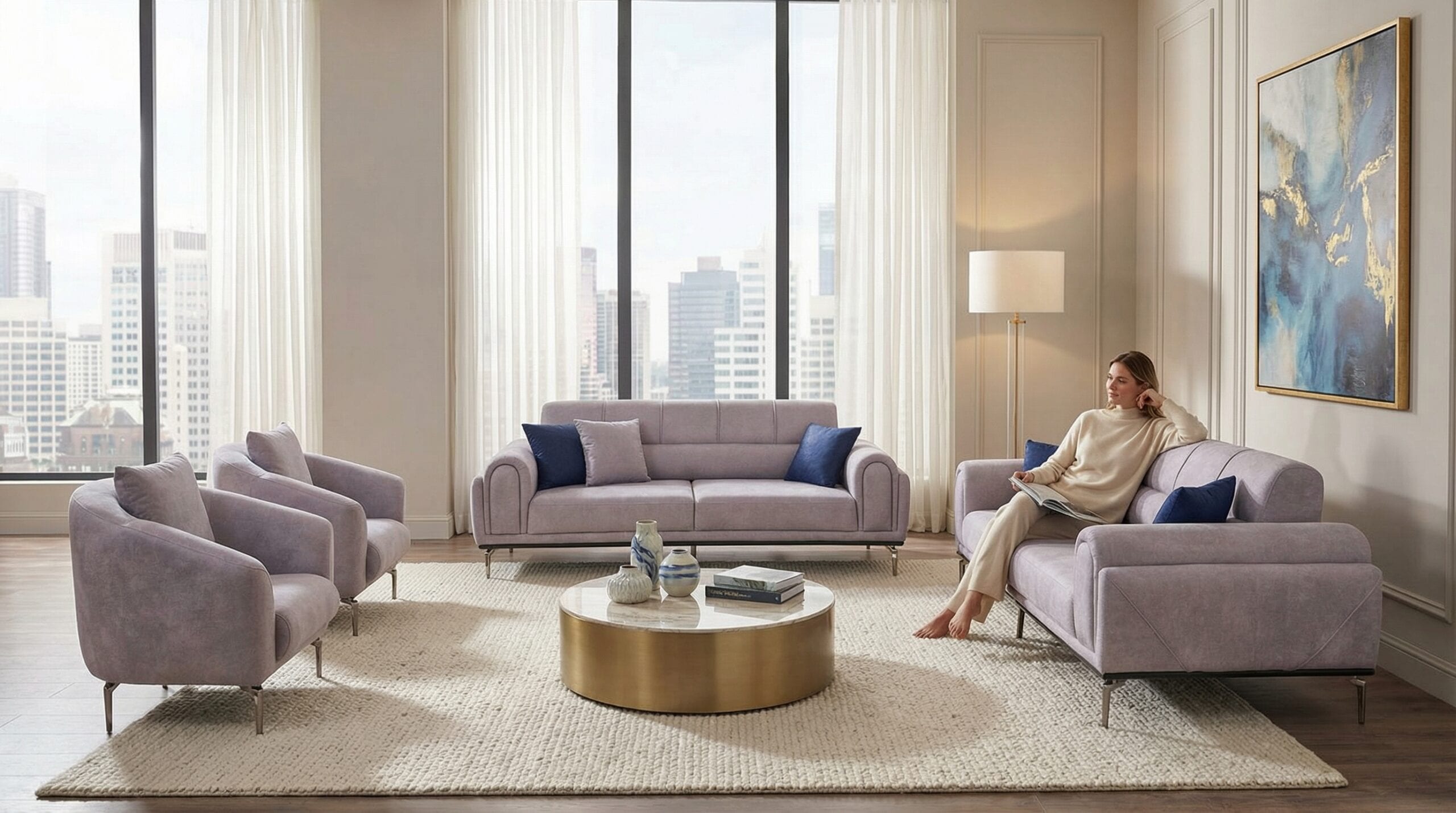
- 60% dominant color: This typically applies to walls, flooring, and large furniture pieces (like armchairs and sofas). This color defines the room's overall character and is best chosen from neutral or soft tones.
- 30% secondary color: Curtains, rugs, chairs, or smaller furniture pieces fall into this category. It should complement the dominant color while creating a noticeable contrast.
- 10% accent color: Used in small details like cushions, decorative objects, or picture frames. Since these areas are small, you can experiment with bolder, more vibrant tones without overwhelming the eye.
The most common mistake when applying this ratio is carrying the accent color onto large surfaces. For instance, instead of painting a wall a vivid orange, using it only on a few cushions delivers a far more balanced result.
What to Consider When Choosing a Wall Color
Since walls make up the largest surface area in a room, wall color should be considered before—or alongside—furniture selection. Keep the following points in mind when choosing your wall color:
Amount of Natural Light
In south-facing rooms that receive plenty of light, dark and saturated colors (petrol blue, anthracite, burgundy) create a warm and elegant effect. In north-facing rooms with less light, light and warm tones (cream, light beige, powder pink) make the space feel airier.
The Wood Tone of Your Furniture
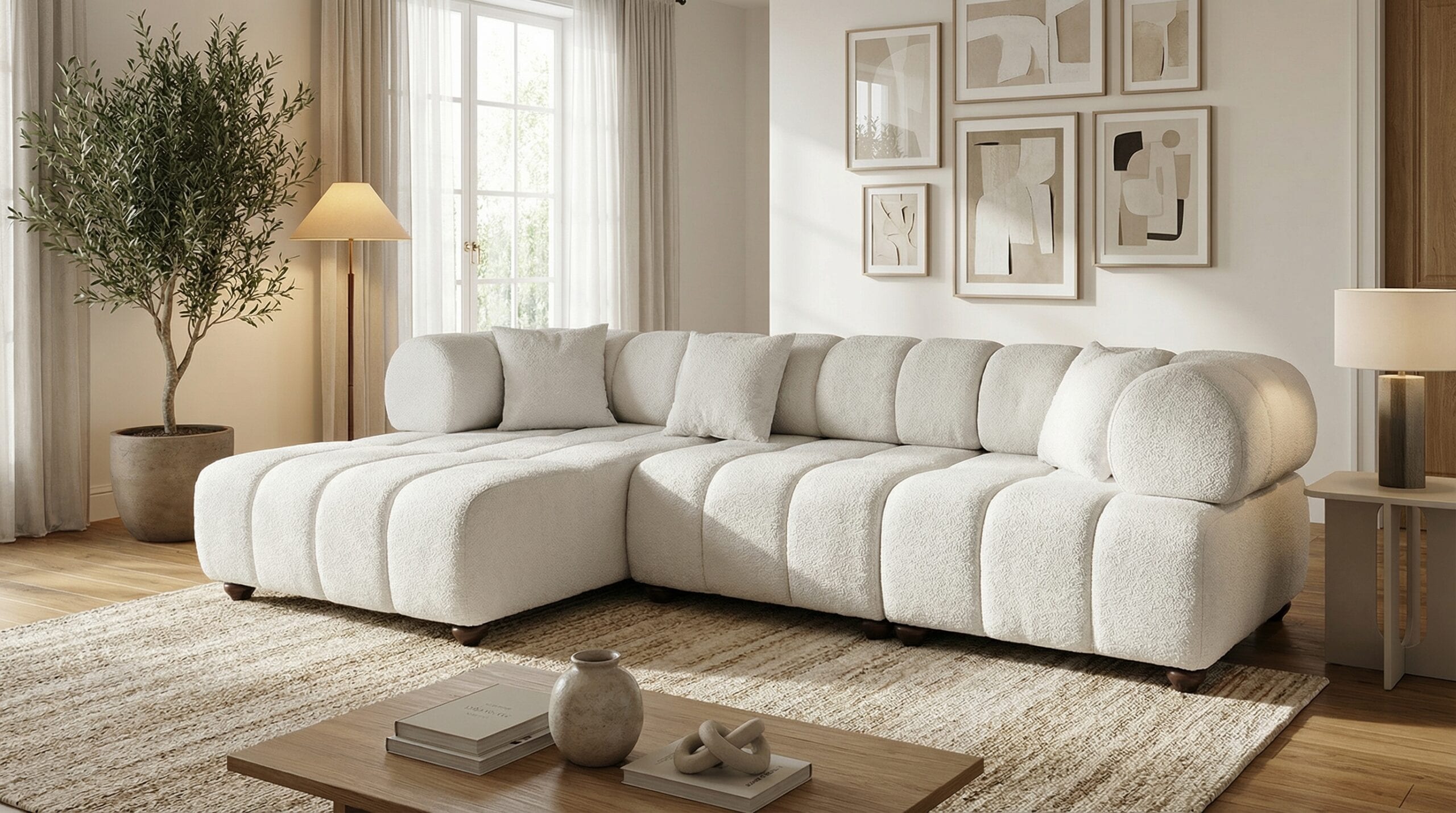
Natural wood tones, such as those found in beechwood-framed furniture, typically carry warm yellow-brown undertones. When selecting your wall color, choose shades that complement rather than clash with these undertones. For example, a gray-blue wall creates a lovely contrast with warm wood tones, while a wall color leaning toward orange can clash with the wood.
The Room's Purpose
Warm neutral tones that encourage socializing work well in living rooms, while calming cool and pastel tones are better suited to bedrooms. This distinction creates not just an aesthetic effect but a psychological one as well.
Balancing Contrast Between Furniture and Textiles
The relationship between furniture color and textiles (fabric, curtains, rugs, cushions) determines whether a space feels "lively" or "flat." Three main approaches can be used here:
- Monochromatic harmony: Using different shades of the same color (for example, a light gray sofa, a medium gray rug, and dark gray cushions). This approach creates a calm, elegant look, but can feel monotonous if not applied carefully.
- Analogous harmony: Using colors that sit close to each other on the color wheel (such as blue-green-turquoise). This offers a natural, flowing transition.
- Complementary contrast: Using colors positioned opposite each other on the color wheel (such as blue-orange or purple-yellow). This creates a more energetic effect, but can strain the eye if used on large surfaces—so it's generally best reserved for small accent pieces.
For example, if you've chosen a seating set in light gray or beige tones, you can create an analogous harmony with mustard yellow or earth-toned cushions, or achieve a more contrasted, characterful look with navy or emerald green accents. Choosing easy-to-clean fabric gives you the freedom to experiment with such color combinations more confidently in everyday use.
Color Strategy Differences Between Small and Large Spaces
The size of the space is also a key factor when building a color palette:
Small Rooms
Using too many colors in a small living room or bedroom makes the space feel even smaller. Instead, working with a single dominant color and 2-3 of its shades visually expands the space. It's best to use light tones on walls and large furniture, reserving darker colors for just a few accent points.
Large Rooms
In spacious living rooms with multiple seating groups, you can use slightly different colors from the same palette for each group. This helps divide the space into sections while maintaining overall unity.
A Practical Step-by-Step Approach to Building a Color Palette
If you're not sure where to start, following this order makes the process much easier:
- Identify the largest, most permanent element in your home that you don't plan to change (usually the flooring or a large seating set).
- Define this item's main color and undertone (warm or cool).
- Choose a wall color in a neutral shade that complements this main color.
- Determine a secondary color for medium-sized textile items like curtains and rugs.
- Experiment with bold accent colors in small details like cushions, artwork, and vases.
- Finally, bring all the pieces together and check how they look under both daylight and evening lighting.
While going through these steps, placing fabric swatches and paint samples side by side and photographing them makes it easier to compare them on screen or in natural light. Since colors can look different under artificial light versus daylight, it's important to test them in both settings before making a final decision.
The right color palette isn't made up of perfectly matched colors—it's built from proportions that balance one another.
Paying attention to how fabric and wood tones create undertone harmony with each other is one of the most critical steps in furniture selection. For instance, when comparing different fabric color options within the seating sets category, keeping your home's wall and floor colors in mind helps you make more informed decisions.
In the end, building a harmonious color palette isn't a complicated art—it's a systematic process that takes the right proportions and lighting conditions into account. By using the 60-30-10 rule as your guide and shaping your furniture and textile choices within this framework, achieving a lasting, effortless sense of unity in your home becomes much easier.
Let's find the right model together
Let Belvora AI recommend the best model for your room size and lifestyle.
Get a free quote